Gothic Minuscule: Textura and Textualis

A short representation of the history of Latin script and the individual scripts should enable an approximate dating of the texts in the archive. You should be able to judge at first glance if you have an early or late medieval handwriting or a modern source.

Comparing scripts can also provide evidence of the origin (provenance) of a text. However, determining the date and location of the origin of a manuscript based on the script alone is difficult and can only be accomplished through the combined work of specialists.

There is a basic distinction between the following:

Majuscule scripts

Capital letters
Two-line system
No ascenders and descenders

Minuscule scripts

Lower case letters
Four line system
Ascenders and descenders

Cursive
Quick, flowing writing
Mostly connected letters
Frequent loops


The nomenclature of scripts and the description of the scripts is not uniform. Specialists sometimes distinguish kinds of scripts of individual monasteries (scriptoria). However, of such an attribution is often problematic and rarely possible for laypersons.

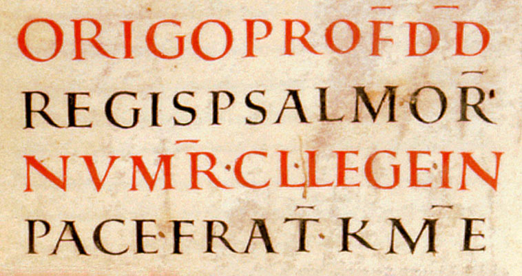
Capitalis quadrata, around 830
Zentralbibliothek Zürich, Ms. Car. C 1, fol. 220r

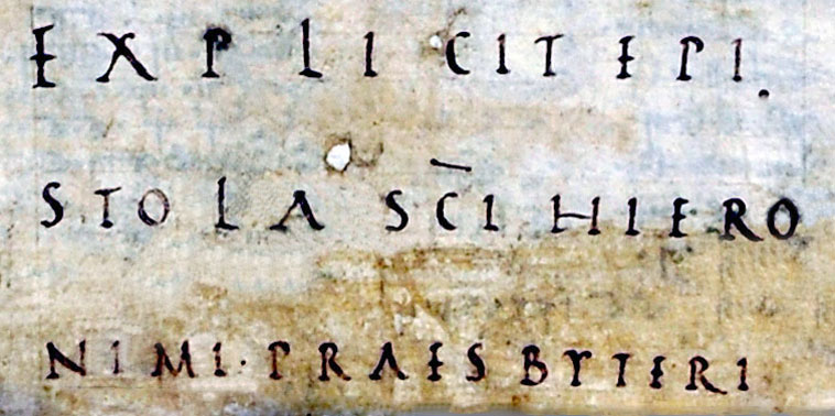
Capitalis rustica, around 830
Zentralbibliothek Zürich, Ms. Car. C 1, fol. IVr

The starting point for the development of the medieval script was the Roman Capitalis. It is a majuscule script, which means it is formed entirely of capital letters of equal height. 

Medieval majuscule scripts are oriented strongly on this Roman model, which was mainly used for stone inscriptions. Three majuscule scripts can be distinguished: Capitalis quadrata, Capitalis rustica und Uncial.

The Capitalis quadrata is depicted as Capitalis monumentalis. Its name derives from the geometric relationship between the height and width of the letters (this is clearly visible with the letters M,N,O,D).

In the case of Capitalis rustica, however, the letters are not as wide as they are high. The letters are also usually closer together, resulting in narrower proportions.

Uncial, end of 9th century
Zentralbibliothek Zürich, Ms. Car. C 161, fol. 1r

Half-Uncial, 5th century
Zentralbibliothek Zürich, Ms. C 79b, fol. 6r

Uncial is a pure majuscule script. Its shape, however, is not square or angular as it is in Capitalis, but round. This also explains the name (Latin uncus = ‘curve’, ‘hook’). This is particularly recognizable in the letters E,M, and U (instead of V). As book script, the Uncial emerged in texts of the late 3rd to the 8th centuries.

The Half-Uncial trains the ascenders and descenders further than the Uncial. It is not clearly described as majuscule or minuscule script, but instead stands between both basic types. The ascenders are especially obvious in b,d,h,l and the descenders in f,g,p,q. The a which resembles a ci or cc, g has a wavy descender, n is often written in the majuscule form.

Capitalis and Uncial were continued to be used in the Medieval period after the transition to the minuscule as markers for headings, incipits, explicits, and rubrics.

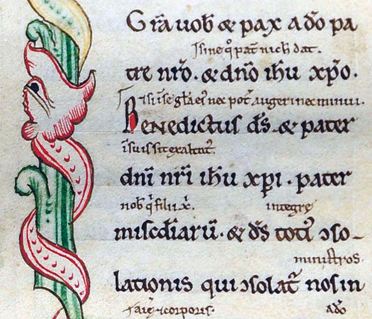
Pre- and Early Caroline Miniscule
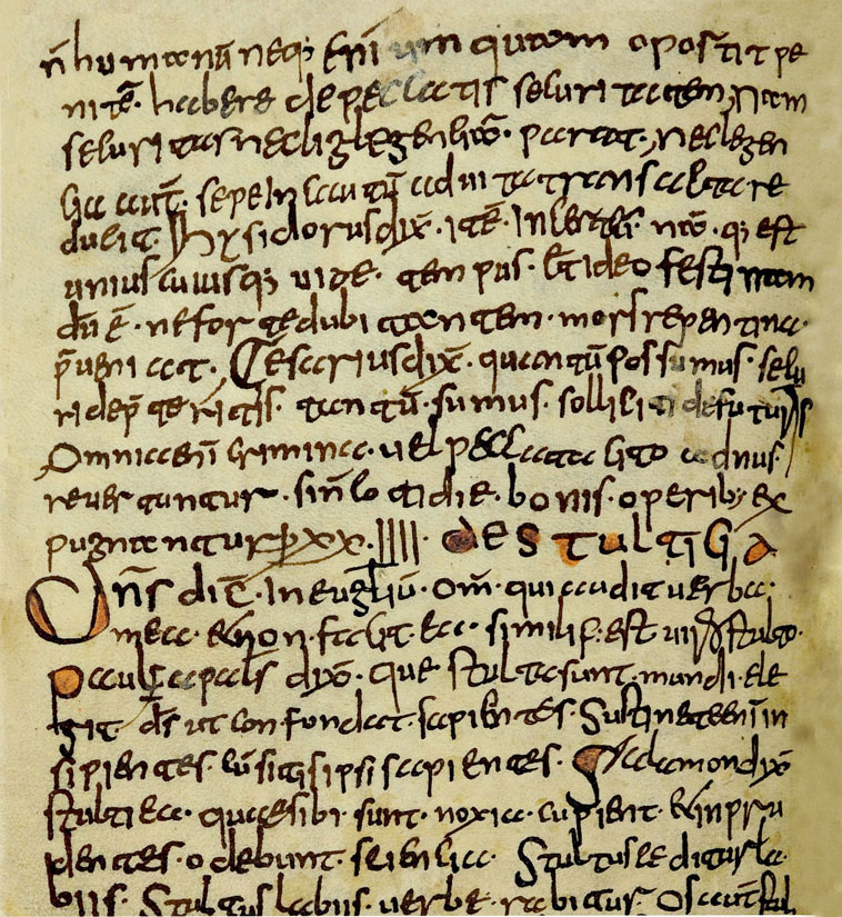
Liber scintillarum, 8th century, St. Gallen
Zentralbibliothek Zürich, Ms. C 65, fol. 9v

The dissolution of the Roman empire led to a regional development in scripts. For this reason, historians of the 19th century called this time the «era of national scripts» (6th to the 11th centuries).

The common feature of these scripts is that they further developed the Half-Uncial and the Roman cursive into minuscule scripts (for example: Lombard script, Visigothic minuscule, Beneventana). Some of them are difficult to read.

Particularly noteworthy are the insular writings that originated in the Irish Anglo-Saxon area. From the Insularis there is a strongly rounded type and later the cursive pointed script. The oldest sources in St. Gallen, Fulda, Mainz, Würzburg, and Salzburg are classified by the rounded type. Especially obvious in the pointed script are the a (triangle shaped) and the f (with descenders and center line). R and s are very similar and easy to confuse. 

The early Carolingian minuscules of the 8th and 9th centuries, as writings of transition, gave rise to the next significant change: on the one hand, their numerous ligatures continued traditions of cursive writing from the late antiquity and their letterforms continued older minuscule scripts. On the other hand, some of their variants formed the basis for the next stage of Latin writing: The Carolingian minuscule.

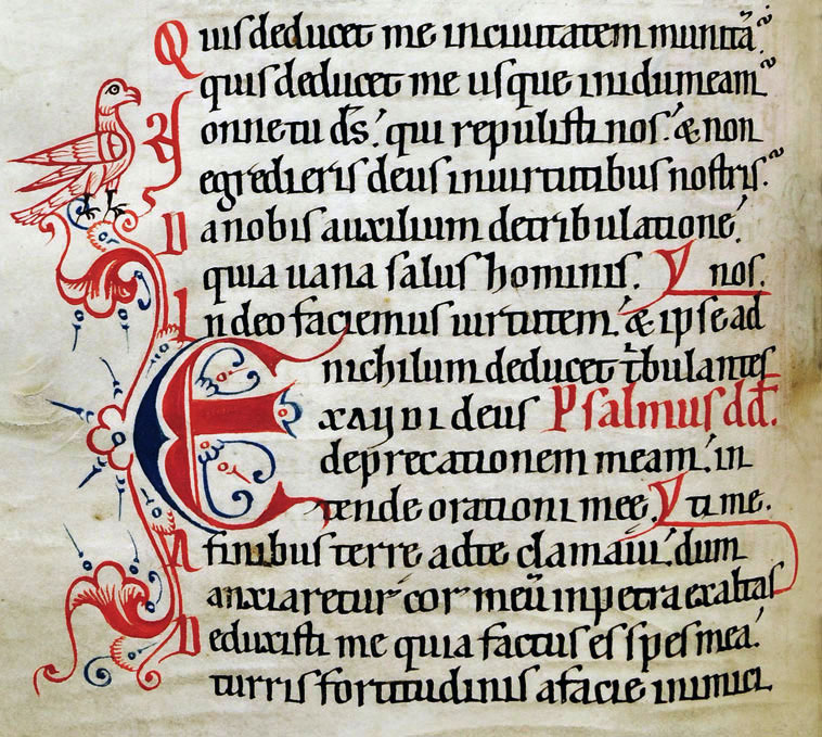
Caroline Minuscule
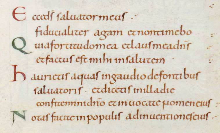
Psalterium, France, end of 9th century 
Zentralbibliothek Zürich, Ms. Car. C 161, fol. 163v

The Carolingian Minuscule was created around 800 from balanced stylized elements of various predecessor scripts in the educational centers of the Carolingian Empire. It was a new, clear, and uniform script that was introduced throughout the country under the reign of Charlemagne. Regional scripts were preserved for a long time in the peripheral areas. The Carolingian Miniscule is a shaped book script. It is distinguished by the following features:

  • consistent use of the four-line system
  • unconnected letters
  • few ligatures

For headings, capital letters were still used (capitalis, uncial, mixed and ornamental forms).

The Carolingian minuscule remained in use for almost four centuries, although some of the letter’s forms have changed. Though, determining the date based on the letters is not easy because the basic script remains relatively uniform.

A special formatio is the diplomatic minuscule, which has been used in royal documents since the second half of the 9th century. Its characteristics are large curved and curly ascenders as well as grid writing in the first line and in the recognition line.

Late Caroline Minuscule
Epistolae Pauli, 12th century
Zentralbibliothek Zürich, Ms. Car. C 149, fol. 51v

Early Gothic Minuscule
Psalterium, Schaffhausen 1253 
Zentralbibliothek Zürich, Ms. Rh. 85, fol. 61v

The transition from Late Carolingian to Early Gothic Minuscule is fluid. It is comprised of mixed forms, just like the Romanesque Minuscule or the Carolingian-Gothic mixed script. This process of transformation was completed around the end of the 12th century, this process of transformation was completed. Since then, the features of these scripts have hardly been reminiscent of the Carolingian minuscule.

The changes compared to the Carolingian minuscule are the breaking, the narrowing of the shafts, the stretching, and stronger emphasis of the vertical as well as the arch connection (de, do, be, bo, or). The arches and half-arches were no longer written in a round and single stroke, but instead the pen needed to be repositioned in the point (Gothic breaking).

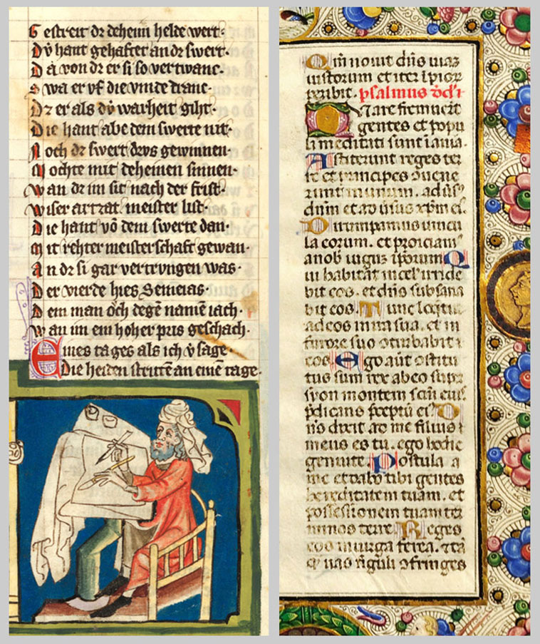
left: Textura or Textualis formata
Rudolf von Ems, Weltchronik, around 1350
Zentralbibliothek Zürich, Ms. Rh. 15, fol. 218v

right: Rotunda
Psalmen und Brevier, Italy, 15th century
Zentralbibliothek Zürich, Ms. Rh. 182, fol. 9r

The Textura developed from the Early Gothic Minuscule in the 13th and 14th centuries. The basic principles of the breaking of arcs, the organization of shafts on the line and the stretching of the mid-length area to the detriment of the ascenders and descenders as well as the arch joints are fully developed and lead to that interwoven, grid-like typeface to which the typeface owes its name. As a result, letters that consist only of shafts in the center band are particularly difficult to distinguish, since the letter i is still written without an i-line or i-dot for a long time. Thus, letter combinations such as mm mi ni ui in iu iii etc. can often only be deduced from the context.

The founding of universities and associated institutions increased demand for naturally limited resources (such as parchment), which led to a change in the design of books. During this time, the texts became smaller, more crowded, and abbreviations were used significantly more.

Compared to Textura, Textualis is a simpler script that could be written faster. Another important feature is that the letters are placed unconnected next to each other and f and long s remain on the bottom line without descenders. 

In Italy and France in particular, the rounded forms of the letters were were preferred. This script is called Rotunda or Textualis semiquadrata.

The Textura or Textualis formata was used for books of significant  importance and became a model for the types of early book printing (Gutenberg Bible)

Bastarda
Livre d'heures, France (Tours), 15th century
Zentralbibliothek Zürich, Ms. C 168, fol. 17r

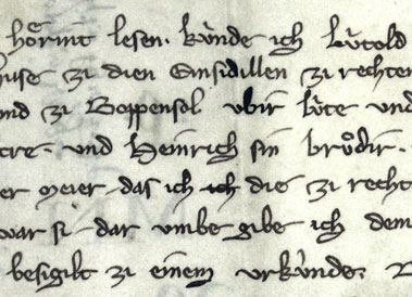
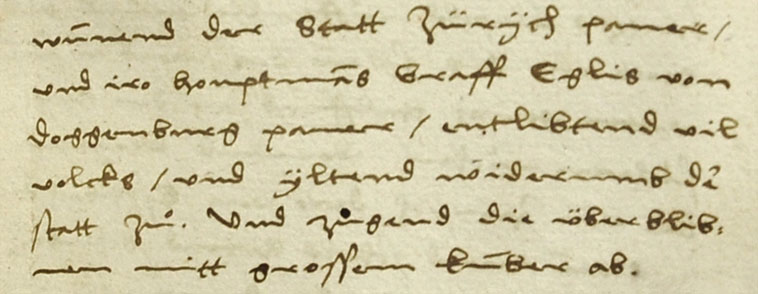
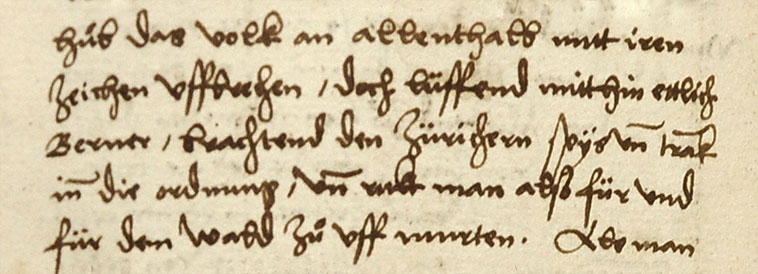
Gothic Cursive
Charter of Lütold of Regensberg, 1285
Klosterarchiv Einsiedeln, K.P.1.

The Bastarda developed in the 13th and 14th centuries. It has features of both textura and textualis, but tends towards italics. Characteristics are a high style level, strongly formed letters with little connection (although there are also bastardas with loops) and distinct descenders at f and long s, whose shafts are usually clearly thickened. Another characteristic feature is the visible slant of the typeface. All in all, the late medieval increase in writing has led to a greater differentiation in the use of type depending on the context of use: from very beautifully designed letters in books to simple scripts.

The increased use of writing in administration and business, but also the increased demands on scientific work led to the development of the Gothic cursive in the 13th century, which was in use until the 16th century. Its lines are more volatile than those of the Textualis or Bastarda. Characteristics are descenders at f and long s, often at an oblique position and letters connected by loops. The Gothic cursive or Latin cursiva was the predominant typeface in use, but was also used in a more sophisticated form for beautifully designed books with illustrations.

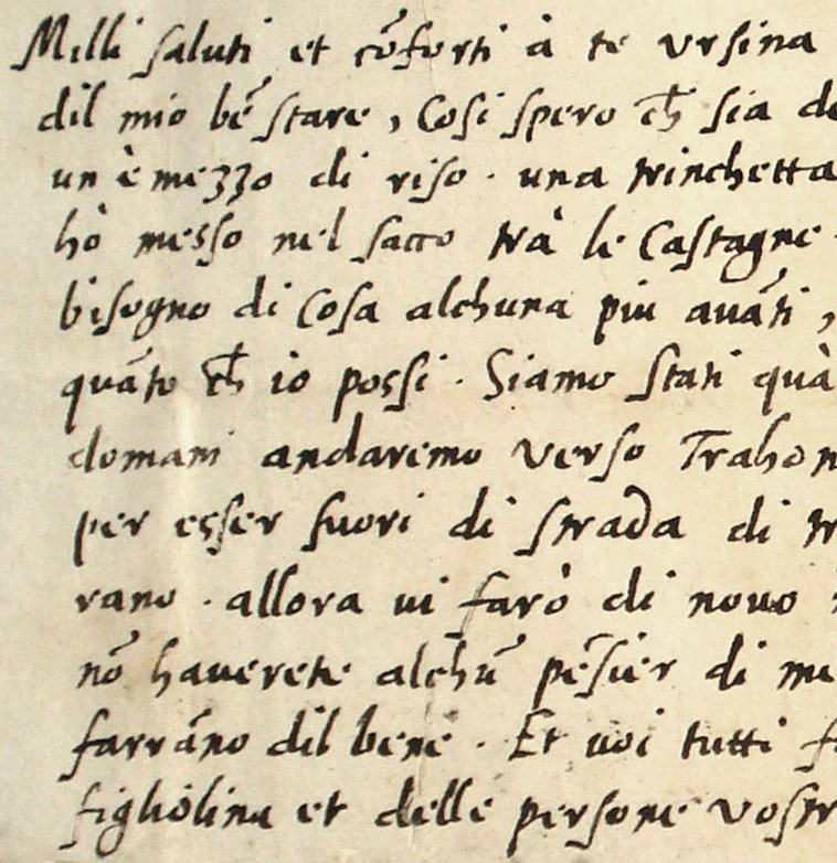
Humanist Minuscule
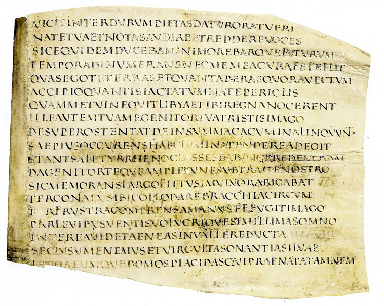
Vergil, Opera, Italy, 15th century
Zentralbibliothek Zürich, Ms. C 83, fol. 2r.

Humanist Cursive
Hans Füssli, Schweizer- und Zürcherchronik with additions by Heinrich Bullinger (so-called Bullinger-Chronik oder «Handbüchli»)
Zentralbibliothek Zürich, M. K 39 Bullinger, fol. 125v.

In the 14th -15th century, humanist scholars increasingly rejected the Gothic texts and instead oriented themselves again towards the Carolingian minuscule. Thus the humanistic minuscule (Antiqua) was created.

The humanistic minuscule is only slightly different from the Carolingian minuscule. The only possible differentiating features are the i-points, the Gothic t, whose shaft pierces the crossbar, and the partial use of the round s and r. Individual mixtures of Gothic writing and humanistic minuscule (Gotico-Antiqua) were also frequently used.

Capitalis continued to be imitated as the bold script. In addition to he humanist minuscule, the fleeting and now strongly individualized humanist italics developed.

The humanistic minuscule (Antiqua) was adopted in letterpress printing along with the textualis (Fraktur). In modern manuscripts, the antiqua was often used for foreign-language quotations (Latin, French, Italian) or as a bold script.

Romanesque script
Staatsarchiv Graubünden, D II a 1.20a

The development of the Latin script was influenced by letterpress printing from the 15th century onwards. The art of handwritten book writing was increasingly displaced by Gutenberg's printing technique with movable letters. Thus, the history of handwriting was increasingly determined by the field of business and utility writing. The utility typefaces also became more and more differentiated according to their purpose and degree of execution. In addition to calligraphic, i.e. pronounced calligraphy, there were also strongly individualized typefaces. 

European writing - written and printed - developed in two strands in the early modern period. These are generally independent of each other and rarely intermingle.

The first strand, the Romanesque script, is rooted in the script tradition of Italian humanism (15th century). This Italian script became the model for modern italics in France, Spain and the Netherlands (e.g. Bastarda Ilana). The Lettre anglaise is also in this tradition.

German Kurrent, 16th century
Hans Füssli, Schweizer- und Zürcherchronik (so-called Bullinger-Chronik oder «Handbüchli»)
Zentralbibliothek Zürich, Ms. K 39, fol. 73v

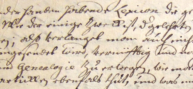
German Kurrent, 18th century 
Universitätsbibliothek Basel, VB Mscr. M 14.3, p. 81

The second strand continued in the tradition of the Gothic scriptures and was particularly widespread in the German-speaking world. This so-called German Kurrent script became the common business typeface of modern times.

It further developed the italic elements of the Gothic cursive, but gradually overcame the refractions. The Kurrent typeface can be recognized by the h with bows at the ascenders and descenders. Also characteristic is the letter e that is shaped like a flower bud, which was opened in the second half of the 16th century and has been used almost exclusively in two strokes since the 17th century.

Since the second half of the 17th century, i and j, u and v are each written according to their phonetic value. At the same time, capitalization of all nouns became more and more common. In the baroque period, capital letters were increasingly squiggled.

Until the middle of the 20th century, the Kurrent script was the most common typeface in Germany.

Capitalis quadrata

Vergil hand-writing, 4th to 5th century
Erhart / Hollenstein 2006, p. 84

In the early Middle Ages, punctuation was used for rhetorical structure. It was based on pauses in speech and metrics, not on grammar.

Texts were usually structured by initials. Red-colored majuscules marked the beginnings of sentences. Text sections were later also marked with paragraph marks. Many texts, however, were without any punctuation. 

Various means of text organization and punctuation marks, which help us today in organizing a text and seem irreplaceable, developed only with time. Word division, for example, became established only very slowly. It was not until the 9th century that the words were consistently written apart.

Hyphenation by a stroke at the end of a line became common only in the 11th century, by two strokes then in the 14th century. Question marks have existed since the Carolingian minuscule. Exclamation marks were not even used until the 16th century.

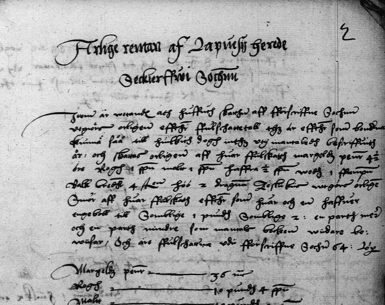
Neo-gothic script, bailiffs' account of Lappee, 1545
National Archives of Finland, http://digi.narc.fi/digi/view.ka?kuid=2661303.

The Gothic script developed in twelfth–century France was used in Western and Central Europe. It was characterized by an emphasis on vertical, straight lines and sharp angles. The Gothic style was ousted in Southern and Western Europe by the humanist cursive or Latin script, developed in fifteenth–century Italy. Humanist cursive script is pretty close to contemporary handwritten script and is therefore fairly easy for people to read today. The neo–Gothic script based on the Gothic writing style developed in the German language area remained in use in Northern Europe until the nineteenth century. The neo–Gothic alphabet developed based on the Fraktur typeface which was always used in Germany until the beginning of the twentieth century. When Sweden broke away from the Kalmar Union, the kingdom strengthened its ties to the German language area and this was also visible in the use of neo–Gothic script from the 1520s onwards.
One distinctive feature of neo-Gothic script is that the final stroke of several letters was separated from other letters by an extra loop. This was usually done for the letters a, g, q, v, w, and y. Other letters too, such as b, l and t, may have had an additional loop. A few letters were distinguished from other letters by a diacritical mark above the letter. A curved dash was marked above the letters u, v and w. The letter y is difficult to distinguish from the combination ij, as two dots were also marked above a letter y. Often the difference can only be detected by the way the word sounds, although a number of scribes turn the stem of the letter y to the left, while in the combination ij, the stem of the j is almost straight. The shape of some letter combinations is difficult to identify at first in some handwriting. These include ff, fft, sk, ss, st and tt.
In the sixteenth century it was typical to abbreviate words from the middle. One way was to cut the word off in the middle and indicate the end of it with a wavy dash (suspension). The word could also be abbreviated by leaving out letters from the middle of it. The months of September, October, November and December were shortened, using the number and suffix –bris or –ber (7bris = Septembris, 8bris = Octobris, 9bris = Novembris and 10bris = Decembris). This was based on the oldest Roman calendar, in which these months were in positions 7–10. The fact that letters were missing from a word was indicated by a line above it (contraction). This was often still done for the double consonants mm and nn in the eighteenth century. Otherwise, the use of abbreviations declined in the seventeenth and eighteenth centuries. In addition, a variety of characters were used to describe letter combinations, words or measurement and monetary units. The hyphen (dash) used resembled today's equals sign (=). Capitalization was unstable: often it is impossible to say whether a letter is upper or lower case.

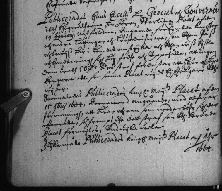
Judgement book, Pielisjärvi and Liperi winter session, 1685
Finnish National Archives, http://digi.narc.fi/digi/view.ka?kuid=3723505

German neo-Gothic script stabilized during the seventeenth century, when the variation in matters such as capitalization and punctuation use, which was still inherent in the mid-sixteenth century, decreased. The development of the script was characterized by inertia. Much of the typical letter shapes and diction of the previous century was retained for a long time alongside new conventions. This means that the boundary between the typical writing styles of the two centuries is very fluid. Diction learned young did not disappear in later life. During the course of the seventeenth century, the vertical handwriting that had been typical in the past began to slant more and more to the right. Ornate upper–case letter shape is a typical feature of seventeenth–century handwriting, especially at the beginning of each section. Often, an upper–case letter is decorated so richly that it is almost impossible to identify, other than by deduction based on the whole word.
The second characteristic change in sixteenth and seventeenth century handwriting is the appearance of a separate loop between the stem and the last stroke of the letter. Typically, this was the case in the letters a, g, q, r, v, w and y. The letters b, l and t may also have had an additional loop. This feature is already emphasized in many eighteenth century scripts and it makes it more difficult to separate characters into distinct entities. The letter t became taller than before, but the first letter often stayed shorter in the letter combination tt. The letter e developed during the seventeenth century to eventually resemble the letter n in today's alphabet. The letter k often looked like an & sign or number 8 in today's alphabet. In many cases, the identification of letters was complicated by the fact that the letter o was left open from the top, while the loop of the letter d was not joined to the stem.

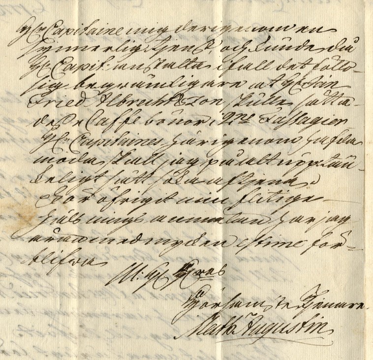
Letter from Matthias August to Petter Claesson, 17 June 1776
Finnish National Archives, http://digi.narc.fi/digi/view.ka?kuid=6117123.

Eighteenth-century diction remained basically the same as it had been in the previous century. However, some handwriting features were many times more pronounced than before. For example, the loop between the letter stem and strokes became more pronounced and heightened compared to other parts of the letter, and letter loops became many times deeper, so that for example it became more difficult to distinguish between the letters a, m and r. Sometimes, particularly in official documents, handwriting may be even excessively slanted to the right. This is attributed to the fact that the scribes were paid according to the number of sheets used, and this way the text would have required more sheets. In general, eighteenth–century hand–written text is characterized by ornamentation and the attempt to create an aesthetic impression.